Addy Osmani intros a Grunt task for removing unused CSS from your stylesheet before serving it.
While this is certainly a worthy goal, I look at the quotes from people who reduced their stylesheets by 3/4 or more and I'm like holy crap what kinda shop are you running over there?! I know "test, don't guess", but I'd guess that pretty close to 0% of the styles I write are unused. I'm sure HTML changes over time make a orphaned rule here and there, but I'd guess that is largely insignificant.
If you're going to do this, make sure you run it against lots (if not all) of your pages so you aren't removing selectors that are in use, just not on every page. I know I write minor styles all the time that make their way into the global stylesheet since that is cached and used anyway.
Say you have a table header (i.e. <th>) of "Number of Howler Monkey Species by Country" and the data in the corresponding <td> is like "3". That's an awkward mismatch of width.
Awkward
Perhaps not a huge problem for two columns, but if you had 20 that would be very hard to navigate and a poor use of space. A better use of space is to rotate the headers so that the column width can be much narrower.
Rotating 90-degrees is too far though. It makes it hard to read.
Interestingly, we get just about the same amount of space saving if we rotate the headers 45 degrees instead, and they are much easier to read.
The Trick
There are a couple of tricks here.
We're going to need to use transform: rotate() to angle the headers. Chrome/Safari lets you do that right on the <th>, but I had trouble with the text disappearing in Firefox that way, so let's do that within a nested <div>. That
we'll force to be the width we want the column to be (it also didn't work to force the cell narrow directly). We're going to need another nested element as well, so...
Note the magic numbers there. I bet some of you are smart enough to figure out the mathematical relationship to all the other numbers going on in there. In fact, my example started out life as a fork of Jimmy Bonney's Column Header Rotation article. I was able to do it without the skew() stuff he was doing which I think makes it a bit simpler, but he also had figured out some math stuff using tan() and cos() which might be a good starting point if you start digging in yourself.
Fallback
If you go down this road, you might wanna make sure you aren't applying rules that screw up the table if the transforms don't work. Modernizr can test for that and apply support/non-support classes to the <html> element, so you can write stuff like:
/* These aren't needed and will be weird if transforms don't work */
.csstransforms & th.rotate {
  height: 140px;
  white-space: nowrap;
}
How you want to do the fallback is up to you, but it could be worse than just having the table be super wide:
This article "Shadow DOM" by Steven Wittens is only vaguely about the Shadow DOM. It's mostly about how awful everything is. HTML sucks, CSS sucks, the DOM sucks, SVG sucks, MathML sucks... I don't want to pick on Steven. He is, without a doubt, many (many) times smarter than I am and has well articulated points. Let's go wider.
I see this regularly from people who have been at this a long time and are very smart. They develop a dislike of the systems we have to work with. They see all the warts, mistakes, and especially what they see as deep systemic flaws or historical turns down the wrong path. This is all made worse as we trapse forwards, building upon these perceived cracks in the foundation.
They always have very good points. It's hard to do anything but nod, because they are right, the web does some whacky stuff and has failed us in many ways. Wouldn't it be wonderful if we could throw it all away and work with some new perfectly designed system that meets everyone's modern needs. Sure, of course it would. Do you want to live in your town or a utopian village? I'll take utopia.
Obligatory follow up sentence: but utopia doesn't exist!
There is no alternate layout language for the web. There is no alternative way to deliver accessible content. There is no better replacements vying for the lead here. That's because that's a monumental task. Any contender would need to:
Develop a new system for everything is empirically better.
Get a world of developers to agree that this new system is better and demand it.
Get standards bodies (or something like it) to support it so there is oversight and an independent source of implementation information.
Get all browsers to agree and implement it perfectly.
lol right.
All those things are so insurmountably difficult that it's no wonder it is rarely even attempted. I'd argue that #1 is the hardest. There are plenty of flaws with our current system, but imagine starting from scratch with something this complex.
I feel like what is going on now in web tech is that these problems are trying to be solved on a smaller scale.
It sure is a bummer HTML is our content, but also responsible for semantics, right? It would be nice to do whatever we wanted in there and not worry we were hurting semantics. Hopefully Shadow DOM can help with that. Maybe it can also help with CSS being to over-arching when you don't want it to be.
Maybe flexbox, grid layout, and regions can be the truly powerful and intuitive layout system we've always needed, without the accessibility issues inherent to tables.
SVG isn't perfect, but maybe it's still better than using a raster image format for a vector image? Maybe SVG has the potential to help with icon systems on sites in a better way? Maybe we can start using a new image format that increasingly works with modern browsers.
Maybe preprocessors can be a solution to ease authoring of these complex languages and reduce complexity?
Perhaps we can extend the web right now how we might want to see it, using existing tech.
These things are proving that we can make the web better. We can do it slowly. We can do it with the help of standards bodies. We can educate developers and change their thinking over time. We can use the browsers already out there, so we don't need to fight public behavior.
I think that sounds nice. And I don't think we have much of a choice.
The following is a guest post by Ian Marquette. Ian learned that SVG can have a <text> element, meaning that text could come from a dynamic source while still being able to do cool custom SVG-specific stuff to it.
I was recently working on a WordPress-based website that needed an infographic. Being a proponent of responsive design, I drew the infographic in Illustrator and exported it to SVG for scalability. While tinkering around in the backend I discovered that you can add WordPress custom fields to SVG text elements that allow you to control text-based content from within your WordPress CMS. How awesome is that?
Here I'll explain how I did it, and some further options you might find useful.
Preparing the SVG File
Create the graphic in your vector-editing software of choice. Add placeholder text to the area you'll want to contain user-controlled text. Here I've created a simple graphic for demonstration purposes.
My SVG file. Note that the path is to demonstrate something uniquely SVG. It could be a filter or a stroke or anything else cool that SVG can do.
Now open your SVG file with your preferred editor. You'll have to make some changes to the code. In my example the path had to be changed to a <textpath>, given an ID and linked to using xlink. If I didn't do this, each individual character in my text would have its own tag, coordinates etc.
You can just copy and paste the markup straight into a WordPress template. You could also use on of the other methods of using SVG on your page, such as linking to the file as an object. Essentially it needs to be inline SVG, not SVG used as an or background-image.
You'll want to replace the content between the <text> tags with the following code, replacing custom_field with whatever name you want to give yours:
Now create a custom field in the WordPress CMS with this label and populate it.
Now if you check out that page, you should see the custom text sitting inside your custom SVG graphic! Of course custom fields are just one way to do this that is rather extensible. You could use do the post title this way, menus, or anything else that dynamically spits out text from any CMS.
Custom field added to your SVG
Once it's in there the text can be styled just like regular markup. For instance:
...
<textpath class="text-path" ... >
  ...
.text-path {
  fill: orange;
}
Or any other SVG CSS property. That means using custom fonts via @font-face work just fine. You also have access to nice features such as SVG filters and animation.
19% of people never use the command line at all. The largest group, 27%, only run a handful of commands a day.
18% run 10-50 commands, 15% run 50-100 commands, and 15% run 100-1000 commands. I think it's interesting that this group, taken together (10-1000 commands a day) represent the largest number of people (48%).
The smallest group (6%) run over 1000 commands a day. Some people just live in the shell!
Personally, I'm in the 10-50 group. I'm typically doing things like firing up Grunt, starting a Rails server, and related things to get a dev environment set up.
The idea for the poll was based on the common side-conversation that always seems to accompany conversations about command line tools.
Say a new tool comes out that can only be used through the command line. Whatever it does, the end result is desirable. Some folks will be excited and be talking about it and using it. Some folks will think about using it but never get around to it because it's a bit out of the comfort zone. Some people will bemoan the fact it's a command line tool and write it off completely.
Then there will be some comments lambasting the non command line users. Some comments telling them there is nothing to be afraid of. It's easy to agree with that, since of course learning more is always a good idea. But on the other hand, not everybody needs to know everything and there is some tools that, however nerdy, could benefit from a UI. Tools like CodeKit are proof they are desired and highly used.
I suspect tools like Grunt are both:
Getting more people into the command line
Making the command line less difficult
Giving more bang-for-the-buck for learning it
If a new command line tool comes out these days that does something cool, chances are it already is a Grunt plugin or someone will make it one in short order. So now you don't have to learn something new, you just include the Grunt plugin and configure it, which you've probably already done a number of times.
I'm also of the opinion there probably will never be a GUI for Grunt - at least not one that is any good - because what matters in Grunt is the configuration of plugins. Each plugin is so different it would require it's own special UI unique to it, not something generic.
The most interesting bit I've learned here is how broad the spectrum is in command line usage, ranging all the way from zero experience to mastery. That's much different that most things we discuss in web tech, so it's good to keep in mind.
Throughout the life of this site, I've flipflopped (nope, yep) on whether or not I show social sharing buttons on articles. As anything, there are arguments in either direction. We can cover that briefly, but I also want to gather a bit of data on the subject, so that will be our next poll.
The impetus for this poll is the comments I get from people during times where there are no sharing buttons present on my articles. Like:
Hey Chris, I wanted to share an article from CSS-Tricks but there were no sharing buttons. Why?
Sometimes that will come in the form of the tweet, which is sometimes just someone wanting to know if I have any specific thoughts on that, but sometimes someone who legitimately thinks they can't share pages that don't have sharing buttons. Leading me to wonder:
I wonder how many people assume that an article is un-shareable if it doesn’t have sharing buttons. And if that’s any significant loss.
Luke Wroblewski collected some data indicating 0.25% of pageviews will share the page (from great studies like this). That is with sharing buttons present. Make me wonder what that number would be without sharing buttons. Presumably lower, but just to be clear, people can share any link they want, they don't need a button to do it, and certainly some people prefer doing it that way.
There is also the issue of how much an individual share matters. One share from a trusted and highly followed source is better than 1,000 spambot shares. My unscientific guess is that shares you miss out on by not having buttons present aren't worth much anyway. And in fact having sharing buttons can be a turnoff to the same type of people you want sharing the page. I'm not sure how we could get data on that, so let's just go with:
This best describes how I share links on my social media site(s) of choice:
I typically only share pages that have sharing buttons.
I don't use ever use sharing buttons. I share my own way.
I can go either way.
Actual poll is embedded on the site.
I'm not sure if we'll land on any perfect answer, but it will be interesting to think about.
General positives about sharing buttons:
They can make sharing easier, more sharing means more traffic
They remind people to share
You might get more sharing
General negatives about sharing buttons:
They can negatively affect page performance
They can look garish
Low numbers can look embarrassing
At the time of this writing, I have social sharing buttons on this site in the form of simple anchor links that link to those services dedicated sharing pages (rather than the JavaScript powered sharing buttons with all the extra functionality). Like these.
Should they continue their studies or jump straight into the labour market? I usually tell them that ability trumps education and I don’t put much faith on the current raft of tech degrees. So I’d prefer to see three years of experience than three years of study.
That being said, I’ll also point out that University is about much more than just acquiring a skill. It’s a formative experience that will shape your attitudes for the rest of your life. It’s also a huge amount of fun...
Solid advice. If your life is a singular mission to become an incredible web worker, university may not be for you. But you'll (probably) grow up faster and have more fun at school.
I redesigned this site a smidge. It's not a huge re-thinking or as big of an undertaking as v10 was, but it's different enough I'm going to call it v11.
Some of it looks like this:
Less
Gone is the Downloads section (also has been called "Demos"). While that got a good amount of traffic, I never kept it up and the demos were getting long in the tooth. I live in a world of demos and that place is CodePen now.
Gone is the Gallery. As much as I liked it, experience taught me I didn't update it enough to be worth it. I still have a huge archive of screenshots I obsessively capture, but until I can figure out a smoother way post them (and do it responsively) I'm going to let that be.
Gone is the ability to search specific sections of the site. All that did was link to different Google Custom Search engines specifically limited by sub-directory. The default search is good enough.
The logo is just simple one-color Gotham Rounded now. I still think of the asterisk as the logo mark for CSS-Tricks, but I couldn't figure out a good way to incorporate it. I'm sure it will return someday.
Gone is the slew of links in the footer. Only the important ones are left.
The homepage (and rest of the site) is 2-column instead of three.
Simpler feels better around here.
More
While in some ways there is less, there is also more posts shown on the homepage. It's such a lightweight and easy thing to do, might as well.
Speed
Speed is always a goal here, as it should be on any website.
There are less icons in use. For the ones remaining, I dropped icon fonts in favor of an inline <svg>icon system, meaning zero requests.
There are only a handful of images left and I plan to nix as many of them as I can.
A good homepage load is typically under a second, which is a solid place to be. I plan to keep working on it. I think there is a few more resources I can either combine or remove.
On pages with a lot of comments, it's clear that Gravatar is the slowest thing, mostly because it can be a ton of individual requests. I'd like to start attempting to lazy load those. I'm not ditching them I don't think; I've always been a fan of avatars next to comments and other user-authored content.
While I was using H&FJ Cloud Typography fonts, I originally went with Ideal Sans for the body font. I also love it, but I got a ton of complaints right away that it rendered poorly in the classic Window/Chrome scenario. I could have tried out some things, but the fonts were also loading a bit slowly, so I decided to nix Ideal Sans and go with a (gasp) non custom font. Just regular ol' Lucida Grande. I don't love it, but it's fast and renders fine everywhere.
Look
Generally better aesthetics is another upgrade - at least in my opinion. I've long been a fan of bright, fun colors, especially on dark. It's a thing I've (poorly) copped from Kevin Hale, which you can see from his slide decks like this one:
There is only a handful of colors defined and I use them over and over in as logical of a system as I can. Feels decently cohesive I think.
A fairly major aesthetic change is the big-ass headers:
I've always liked that — when an article greets you that clearly. It was sort of a last-minute change for this design, and the newish nGen Works blog pushed me over the edge when I saw theirs:
Validation
Dribbble actually validated the whole idea for this design. I posted a simple example there and it got so much positive feedback I decided to go for it.
We're about a week post-launch as I write this, and the design has largely been met positively. That's literally a first =).
Resizeable CodePen Embeds
I was hoping to add more functionality to the site this round, but unfortunately I didn't get to do as much of that as I would have liked. One thing I did get to was making all CodePen embeds resizeable.
Since that functionality is only really useful on large screens, I did a super basic cutting of the mustard to load it in from my global JavaScript:
You'll get an email notification when you are mentioned by @username in a thread. So you know if someone is talking about you or specially trying to get your attention. You can also still subscribe to a thread after commenting (like you can in the blog comments) if you want to keep up to date on all follow-up posts.
You'll get an email notification if your post gets caught in spam, with instructions on who to notify so it's not lost to the ages.
The concept of Featuring and Burying Comments has made it to the forums. Myself, any of the moderators, and the person who started that topic have links to feature and bury replies. I hope that encourages better answers.
For regular Forums visitors, you might appreciate the new All Topics page which shows the most recent activity in all the sub forums combined.
Markdown has made its way into Jetpack, so rather than use a separate plugin for it, I'm using that now. Via a plugin I had custom built by Justin Sainton, Jetpack-markdown is in use in the forums as well as the blog comments, but not on the blog itself (legacy reasons for me). I also replaced the live comment preview with a preview tab in the blog comments. What's nice about that is that it's a real live preview rendered by the server, so it's not faking it with a client side lib like it was before.
In v10 I never quite finished the responsiveness of the Forums. Should be much better now in v11, although not perfect.
History
I've added v11 to the absolutely embarrassing Design History page on this site.
Issues
There are still some things I'm ironing out. If you see a bug, the best way to make sure I'll see it is to shoot over a message - and it would be much appreciated.
The following is a guest post by Bryan Jones, the creator of CodeKit. I've been using CodeKit for a couple of years now and I've talked about it plenty. In my opinion it changed the game in front end development making it easy to use advanced tools that, while powerful, felt out of reach for many. Now CodeKit 2.0 it out, which has followed the landscape of front end development, bringing us more powerful tools that are tough to pull off otherwise. Bryan is going to introduce it, and I'll interject here and there to share my thoughts as I've been using 2.0 the last month or so.
What is CodeKit?
CodeKit is an app that helps you build websites faster. It compiles all the cutting-edge languages like Sass, Less, Stylus and CoffeeScript. It live-refreshes your browsers. It combines, minifies and syntax-checks JavaScript. It even optimizes images. All stuff that speeds up both your website and your workflow.
There are other ways to do these things, but CodeKit's mission is to take the pain out of the process. You drop your project folder onto the app and get to work. No JSON files to edit, nothing to install or download. No commands to memorize. It just works.
What's New in 2.0?
For starters I hired a designer (Guy Meyer) so the UI no longer looks like it was repeatedly beaten with a DOS 5.1 manual. The new version is also 1,400% faster thanks to a bunch of optimizations and works a lot better in team environments.
But what you really care about is how it can make you faster. So instead of listing every new feature, here's the top four that will make a difference right away:
1. Refresh Every Browser
Your website has to look good on lots of devices. You pull it up on an iPhone, an iPad, a Galaxy S3, Chrome, Firefox and even IE 11 on a PC. That's a lot of refresh buttons to click. CodeKit can do that for you.
CodeKit will now live-refresh all of these devices and more. Make a change to your code and a split-second later, every device updates to show those changes. No plugins, no complex configurations. It works even with advanced sites like WordPress and Drupal. Just click the Preview button in CodeKit and then copy the URL to your other devices. Once you see this in action, you won't work without it ever again.
Note from Chris: Not only does the page literally refresh when you change something like a template or JavaScript file, the page will do style injection for CSS changes (whether they came from a preprocessor or not). Meaning designing for interactive states is a lot easier.
CodeKit 1 could do style injection too, but now CodeKit has it's own server built-in (which can forward to MAMP or anything else if you prefer) meaning that literally any browser gets the refreshing and style injection.
2. Bower
Bower lets you quickly install over 7,000 components: jQuery, Modernizr, Bootstrap, even WordPress. Bower is now built-in to CodeKit, so all those resources are just two clicks away. Open the Assets area, select the components you want and click the cloud icon. CodeKit grabs the latest versions from the web, along with any required dependencies, and puts them right in your project.
CodeKit also saves you a ton of work when it's time to update components. Just open the Assets area and choose the Installed tab. It'll show you the version of each component in your project and what the latest one available online is. Update them all with a single click, or pick and choose.
Note from Chris: while I haven't had a chance to use Bower a bunch yet, keeping front end dependencies up to date is the #1 reason I want to.
3. Autoprefixer
Vendor prefixes: the CSS rules that only an IE6 Engineer could love. Autoprefixer makes them painless and it's now built-in to CodeKit. You just write standard CSS and Autoprefixer adds all the necessary vendor prefixes based on the latest information about each browser. It works seamlessly with Less, Sass and Stylus. It's also totally configurable: just specify which browsers you need to support and it does the rest.
Note from Chris: I think Autoprefixer is almost as big of a game changer as CodeKit itself, and they are a perfect match for each other. While I'm still a big fan of preprocessors, I'm no longer a fan of using them for prefixing. Autoprefixer is a much better way to handle it. You can learn more about it from it's creator here.
4. Libsass
You're reading CSS-Tricks, so you probably write Sass. It takes a few seconds to compile, right? Not anymore. Flip on Libsass in CodeKit and your Sass compiles instantly. Libsass is a new Sass compiler written in C instead of Ruby, so it's like Justin-Beiber-tanking-his-billion-dollar-singing-career fast.
Now, Libsass is a beta, and some advanced Sass features (like namespaces and the new 3.3 syntax additions) aren't supported yet. But Libsass is advancing rapidly and the goal is to reach complete parity by this summer. Unless you're doing really complex stuff, you can probably use it today and drastically speed up your work. (We used it on CodeKit's site and that one has some really bleeding-edge CSS going on.)
Note from Chris: While Bryan correctly joked I prefer Sass, I don't care tremendously much what you use, because there are things that are very likeable about all the CSS preprocessors. One of the few strikes against Sass is that it's slow to compile compared to the JavaScript-based preprocessors. Libsass makes Sass the fastest as well, so that's pretty awesome (if you can use it).
More Cool Stuff
OK, I lied. There's way too many new features to stop at just four. Here's four more features you'll love:
Source Maps
CodeKit can create source maps for Sass, Less, CoffeeScript, JavaScript and TypeScript files. (By the way, CodeKit compiles TypeScript now.) Source maps let you see your original source code in the browser's web inspector instead of the compiled output, which makes debugging easy.
Zurb Foundation
There's now a "New Zurb Foundation Project" command that pulls down the latest version of Zurb Foundation from the web and sets it up automatically. This was a really common feature request.
Hooks
Need to run a custom AppleScript or Bash script when files in your project change? Maybe tell Transmit or Coda to sync to a remote server? Gzip some files? No problem. Just set up a Hook and CodeKit will run whatever you need.
Note from Chris: It would be interesting to see it run Grunt or Gulp. Part of the beauty of Grunt is there are a zillion things it can do - things that can be super specific and probably aren't a good fit for a core CodeKit feature (e.g. the SVG stuff I described here). I'm not sure if mixing multiple build tools is a good idea or not, but it's worth thinking about.
CoffeeScript Love
If you write CoffeeScript, CodeKit has two new features you'll like. First, you can now prepend JavaScript files (like jQuery) directly to your CoffeeScript files. Do it with a drag-and-drop in the app, or an in-file statement. Either way, CodeKit combines it all into one minified JavaScript file.
Secondly, CoffeeLint is built-in now, so you can syntax-check your CoffeeScript files before they ever compile. This is also handy for enforcing particular styles, like how many spaces a line should be indented.
What's Next?
The short answer is, "Whatever Chris Coyier asks for." The long answer is that I completely overhauled CodeKit's architecture so that adding new features no longer requires major surgery. I plan to move quickly and keep iterating. Jekyll support is at the top of my list. Scaffolding and templates are up there too. HTML minifiers. If-else and loops in the Kit language. As Tim Cook would say, "We have some exciting products in the pipeline."
Get In Touch!
I love hearing from people in the industry, even if they don't use CodeKit. (Grunt FTW!) Come have a look at our new website. I can't take credit; Guy Meyer designed and built it, but we'd really like to hear what you think, one professional to another. You can find me on Twitter: @bdkjones
It's a fun little soundbite to talk about how the web is responsive right out of the box. With no authored CSS at all, a website will flow to whatever screen width is available. If your site isn't responsive, you broke it.
Well that's almost true, but as Adam Morse says in this new project:
HTML is almost 100% responsive out of the box. These 115 bytes of css fix the 'almost' part.
Things like images and tables can have a set widths that would force a layout wider than a viewport. And of course, the meta tag.
I've been a big proponent of icon fonts. Lots of sites really need a system for icons, and icon fonts offer a damn fine system. However, I think assuming you're good with IE 9+, using inline SVG and the <use> element to reference an icon is a superior system.
First let's cover how it works.
A nice way to handle your icons is to have a folder full of .svg files.
That's one of the cool things about working with SVG - they are the source files.
They can be colored, not colored, multiple shapes, sizes, whatever.
You can let Illustrator (or whatever) save it however, with all the cruft that comes along for the ride:
You can manually do this if you want. I've done it. You don't even have to look at the final file. Just call it svg-defs.svg or something.
It should just be an <svg> tag, with a <defs> tag (which just means you are defining stuff to use later), and then a bunch of <g> (group) tags. Each <g> tag will have a unique ID, and will wrap all the paths and whatnot for each icon.
<svg>
  <defs>

    <g id="shape-icon-1">
      <!-- all the paths and shapes and whatnot for this icon -->
    <g>

    <g id="shape-icon-2">
      <!-- all the paths and shapes and whatnot for this icon -->
    <g>

    <!-- etc -->

  </defs>
</svg>
Again you can do that by hand, but of course that's a bit laborious. Fabrice Weinberg has created a Grunt plugin called grunt-svgstore that automates this.
If you've never used Grunt, you can do it. Here's a screencast to get you started.
You can install it with:
npm install grunt-svgstore --save-dev
Make sure the task is available with:
grunt.loadNpmTasks('grunt-svgstore');
And then in the config:
svgstore: {
  options: {
    prefix : 'shape-', // This will prefix each <g> ID
  },
  files: {
    'processed/svg-defs.svg': ['source/*.svg']
  }
},
In the output file, svg-defs.svg, each icon (whatever paths and stuff from the source .svg file) will be wrapped up in a tag with a unique, prefixed ID, and the file name (minus the .svg). Like:
Make sure you use those class names on the svg to size it.
/* Do whatever makes sense here.
   Just know that the svg will be an
   enormous 100% wide if you don't
   reign in the width. */
.icon {
  display: inline-block;
  width: 25px;
  height: 25px;
}
Yay: you can style them (and their parts) with CSS
One of the reasons we loved icon fonts is the ability to style them with CSS. This technique one-ups that in that we do everything we could there, and more, because:
We can style all the separate parts
SVG has even more things you can control, like special filters and strokes
The svg is (kinda) in the DOM, so JavaScript too. Here's some styling possibilities and a demo of this all at work:
On the browser support front, the danger zones are IE 8 and down, Safari 5 and down, iOS 4.3 and down, and Android 2.3 and down. But if your policy is "the last two major versions" - you're looking at pretty much 100% support.
Remember that icons can be used as a supporting role only, like always accompanied by a word. If that's the case, support isn't too big of a deal. If these are stand-alone, and non-display would make the site unusable, that's a big deal.
I probably would go for icon fonts, as the support there is much deeper. Just make sure you do it up right.
This does work in some browsers, meaning you could skip the include at the top of the document. Doing it this way means an extra HTTP request, but that means you can utilize caching more efficiently (not bloat document caching). In testing, Jonathan Neal discovered you need to have the xmlns attribute on the <svg> for it to work:
<svg xmlns="http://www.w3.org/2000/svg">
But even then, no support in any IE. Unless you wanted to swap out the whole <svg><use> with an <object>, which does work. Jonathan Neal again figured this out:
/MSIE|Trident/.test(navigator.userAgent) && document.addEventListener('DOMContentLoaded', function () {
  [].forEach.call(document.querySelectorAll('svg'), function (svg) {
    var use = svg.querySelector('use');

    if (use) {
      var object = document.createElement('object');
      object.data = use.getAttribute('xlink:href');
      object.className = svg.getAttribute('class');
      svg.parentNode.replaceChild(object, svg);
    }
  });
});
His demo now also has a method which makes an Ajax request for the contents and injects that, which allows the fills to work in IE 9. Not as efficient, but more like a polyfill.
I imagine someday straight up <svg><use> linking right to the .svg will be the way to go. Or even perhaps <img> working with URL fragment identifiers on the SVG.
Browsers treat <use> like the shadow DOM:
Right now, we can target, say, an individual <path> with CSS, like:
.targetting-a-path {
  fill: red;
}
But that will affect all instances of that path. You'd think you could do:
But that's not supported yet either and it's not entirely clear if that's exactly how that will work or not.
"Versus" icon fonts
Vector-based: tie
Style with CSS: slight edge to SVG sprites (targeting parts, SVG specific styling like strokes)
Weird failures: SVG seems to just work (when supported). Icon fonts seem to fail in weird ways. For instance, you map the characters to normal letters, then the font loading fails and you get random characters abound. Or you map to "Private Use Area" and some browsers decide to re-map them to really weird characters like roses, but it's hard to replicate. Or you want to host the @font-face files on a CDN, but that's cross-origin and Firefox hates that, so you need your server to serve the right cross-origin headers, but your Nginx setup isn't picking that up right, SIGH. SVG wins this one.
Semantics: Not a huge deal, but I think an <svg> makes a bit more sense for an image than a <span>.
Accessibility: Maybe someone can tell me? Can we/should we give the <svg> a title attribute or something? Or a <text> element inside that we visually hide? Update: the <title> element might do. Or perhaps the <desc> element as used in this SVG access spec.
Ease of use: Tools like Fontello and IcoMoon are pretty good for an icon font workflow, but the folder-full-of-SVGs with Grunt squishing them together for you is even easier, I think.
Ian Feather posted an article about why they switched away from icon fonts as well and I agree with every single point.
The following is a guest post by Agop Shirinian. Agop ran into an interesting scenario where he needed an element to be scrollable in one direction, while allowing the overflow in the other direction. You'd think that's what overflow-x and overflow-y are for, but it's not that simple. I'll let Agop explain.
So you're tasked with creating a scrollable menu with submenus that pop out when you hover over a parent menu item.
Simple!
Create a list for the menu, add some nested lists for the submenus, position the nested lists based on their parent list items, voilà!
Wait, that's not right. Oh, of course, we used overflow: auto - perhaps if we use overflow-x: visible, the horizontal overflow of the submenus will be visible:
If we look at the W3C spec, we find the following explanation:
The computed values of ‘overflow-x’ and ‘overflow-y’ are the same as their specified values, except that some combinations with ‘visible’ are not possible: if one is specified as ‘visible’ and the other is ‘scroll’ or ‘auto’, then ‘visible’ is set to ‘auto’.
Basically, this:
overflow-x: visible;
overflow-y: auto;
Turns into this:
overflow-x: auto;
overflow-y: auto;
So we can't have visible horizontal overflow if the vertical overflow is invisible, and vice versa.
And if we can't have visible horizontal overflow, we can't have our pop out submenus!
The Solution
Interestingly enough, if we omit the position: relative from the menu items, the submenus do show up, positioned based on their closest positioned ancestor. In this case, they don't have a positioned ancestor, so they're positioned relative to <body>:
Basically, in order for an absolutely positioned element to appear outside of an element with overflow: hidden, its closest positioned ancestor must also be an ancestor of the element with overflow: hidden.
Knowing this, we can add a wrapper around the menus to act as the closest positioned ancestor for each submenu. Then, whenever the user hovers over a menu item, we can position the submenu wrappers using a bit of JavaScript:
And that's it! Since neither the menus nor the menu items are positioned, the submenus are able to pop out of the hidden/scrollable overflow. Now we can have as many levels of nested submenus as we want, and we won't get any undesired clipping.
Takeaway
Unfortunately, this method of showing items that would otherwise be hidden is very obscure.
It'd be nice if we could specify a clip depth, which would control which ancestor in the hiearchy would be responsible for clipping a particular element:
./* Fair warning: not real code */
.submenu {
  /* only an ancestor 2 levels up can clip this element */
  clip-depth: 2;
}
Or, even better, perhaps we could specify the clipping parent by a CSS selector:
/* Fair warning: not real code */
.submenu {
  /* only an ancestor that matches the .panel selector can clip this element */
  clip-parent: .panel;
}
Chris Albrecht posted a question on StackOverflow about grids. Essentially: imagine you have an element with an unknown number of children. Each of those children is some percentage of the width of parent such that they make equal rows, like 25% wide each for four columns, 33.33% wide each for three columns, etc. The goal is to fill the space of this "grid" evenly. There are an unknown number of children, so let's say you were going with 25% and there were 7 children, that would be 4 in the first row and 3 in the second. Chris needed the final 3 to adjust in width to fill the space, rather than leaving the gap.
Flexbox has just the answer for this, which would otherwise likely need to be a JavaScript intervention.
The solution is essentially making the children able to wrap with flex-wrap, and then filling the space with flex-grow.
.grid {
  display: flex;
  flex-wrap: wrap;
}

.grid-item {
  flex-grow: 1;
  min-width: 25%;
}
Here's a visual example of that when each grid item is red and separated with a border:
By adjusting the min-width at different @media query breakpoints, you can make it responsive pretty easily:
If you like to balk at flexbox for not being ready to use yet, this example is for you. flex-wrap wasn't in Firefox at all until prettyrecently, and isn't even in stable yet, so probably not a super practical solution for Chris just yet. But remember Firefox auto-updates so when 28 rolls out everyone will have it pretty quickly. I'm still optimistic flexbox will be a pretty standard layout mechanism on new sites within a year or so.
If you only need flexbox for single-directional stuff, falling back to display: table is sometimes an option, if by fallback you mean to replicate the layout with some accuracy. If you need the wrapping, inline-block might work. You can test for flexbox wrapping support with:
@supports not (flex-wrap: wrap) {

}
And possibly fall back to inline-block (with no space between them) If you did that, here's how you might adjust that last row if needed with JavaScript:
var leftovers = $(".child").removeAttr("style").length % 4;

if (leftovers > 0) {
  var newWidth = 100 / leftovers;
  var fromHere = $(".child").length - leftovers + 1;
  $(".child:nth-child(n+" + fromHere + ")").css("width", newWidth + "%");
}
Note the hard-coded 4 in there, which assumes 25% children. You could get fancier and detect that. I'll leave that to you. Selecting the last few stragglers (determined by that modulus (%) operator) I did with a bit of an :nth-child recipe. Here's a demo of it though:
Someone wrote in to me asking how to create a simple bar navigation with icons. This is a pretty simple layout thing that could be accomplished loads of different ways. List items as inline-block probably makes the most sense in general.
But I've been enjoying tinkering with flexbox, so I decided to toss it together with that, and it made for a pretty educational example I think.
Flexbox makes it easy to align the items however you want:
Flexbox makes it easy to allow the menu items to take up as much space as they need, without specifying any exact numbers:
But if you want to apply exact numbers, you can:
Flex items can wrap and the properties can change with media queries:
Flex items are easy to align how you want, even vertically, even with centering:
In the demo, feel free to turn on the outlines to see how the boxes align themselves.
I realize not everyone can use flexbox on everything they work on. Yadda yadda browser support, clients, etc. Some people can, on some projects. After playing with it for stuff like this, I think it becomes clear how important it is going to become.
Imagine something like these Transformer Tabs as a widget in a fluid column in a responsive design. Depending on the browser window width, perhaps this design is either 4, 2, or 1 column wide. When it breaks from 4 to 2, the column probably temporarily gets wider than it was, even though the screen is narrower. It would be preferable when writing the media query logic for those tabs to consider how much space the widget has available rather than the entire window, which might be totally unrelated, especially when re-using this widget.
Jonathan Neal has some thoughts on how this might work, including the complicated bits you might not have thought about, like how a widgets contents might affect its parent container and cause an infinite loop.
This article was originally published on March 2, 2010. It was updated April 1, 2011, July 20, 2011, and again March 3, 2014, each time to clarify and correct browser prefixes and best practices.
Just as you can declare the background of an element to be a solid color in CSS, you can also declare that background to be a gradient. Using gradients declared in CSS, rather using an actual image file, is better for control and performance.
Gradients are typically one color that fades into another, but in CSS you can control every aspect of how that happens, from the direction to the colors (as many as you want) to where those color changes happen. Let's go through it all.
Gradients are background-image
While declaring the a solid color uses background-color property in CSS, gradients use background-image. This comes in useful in a few ways which we'll get into later. The shorthand background property will know what you mean if you declare one or the other.
.gradient {

  /* can be treated like a fallback */
  background-color: red;

  /* will be "on top", if browser supports it */
  background-image: linear-gradient(red, orange);

  /* these will reset other properties, like background-position, but it does know what you mean */
  background: red;
  background: linear-gradient(red, orange);

}
Linear Gradient
Perhaps the most common and useful type of gradient is the linear-gradient(). The gradients "axis" can go from left-to-right, top-to-bottom, or at any angle you chose.
Those comma-separated colors can type of color you normally use: Hex, named colors, rgba, hsla, etc.
To make it left-to-right, you pass an additional parameter at the beginning of the linear-gradient() function starting with the word "to", indicating the direction, like "to right":
.gradient {
  background-image:
    linear-gradient(
      to right,
      red, #f06d06
    );
}
This "to" syntax works for corners as well. For instance if you wanted the axis of the gradient to start at the bottom left corner and go to the top right corner, you could say "to top right":
.gradient {
  background-image:
    linear-gradient(
      to top right,
      red, #f06d06
    );
}
If that box was square, the angle of that gradient would have been 45°, but since it's not, it isn't. If you wanted to make sure it was 45°, you could declare that:
You can also declare where you want any particular color to "start". Those are called "color-stops". Say you wanted yellow to take up the majority of the space, but red only a little bit in the beginning, you could make the yellow color-stop pretty early:
We tend to think of gradients as fading colors, but if you have two color stops that are the same, you can make a solid color instantly change to another solid color. This can be useful for declaring a full-height background that simulates columns.
So far we've only looked at the new syntax, but CSS gradients have been around for quite a while. Browser support is good. Where it gets tricky is syntax and prefixing. There are three different syntaxes that browsers have supported. This isn't what they are officially called, but you can think of it like:
Old: original WebKit-only way, with stuff like from() and color-stop()
There is some overlap in there. For instance when a browser supports the New syntax they probably also support the older syntaxes as well, including the prefix. Best practice is: if it supports New, use New.
So if you wanted to absolute deepest possible browser support, a linear gradient might look like this:
.gradient {
/* Fallback (could use .jpg/.png alternatively) */ background-color: red;
/* SVG fallback for IE 9 (could be data URI, or could use filter) */ background-image: url(fallback-gradient.svg);
/* Safari 4, Chrome 1-9, iOS 3.2-4.3, Android 2.1-3.0 */ background-image: -webkit-gradient(linear, left top, right top, from(red), to(#f06d06));
That's an awful lot of code there. Doing it by hand would be error-prone and a lot of work. Autoprefixer does a good job with it, allowing you to trim that amount of code back as you decide what browsers to support.
The Compass mixin can do SVG data URI's for IE 9 if that's important to you.
IE filters
Internet Explorer (IE) 6-9, while they don't support the CSS gradient syntax, do offer a programatic way to do background gradients
/* "Invalid", but works in 6-8 */
filter: progid:DXImageTransform.Microsoft.gradient(GradientType=0, startColorstr=#1471da, endColorstr=#1C85FB);

/* Valid, works in 8-9 */
-ms-filter: "progid:DXImageTransform.Microsoft.gradient (GradientType=0, startColorstr=#1471da, endColorstr=#1C85FB)";
There are some considerations here on deciding to use this or not:
filter is generally considered a bad practice for performance,
background-image overrides filter, so if you need to use that for a fallback, filters are out. If a solid color is an acceptable fallback (background-color), filter is a possibility
Even though filters only work with hex values, you can still get alpha transparency by prefacing the hex value with the amount of transparency from 00 (0%) to FF (100%). Example:
rgba(92,47,90,1) == #FF5C2F5A
rgba(92,47,90,0) == #005C2F5A
Radial Gradients
Radial gradient differ from linear in that they start at a single point and emanate outwards. Gradients are often used to simulate a lighting, which as we know isn't always straight, so they can be useful to make a gradient seem even more natural.
The default is for the first color to start in the (center center) of the element and fade to the end color toward the edge of the element. The fade happens at an equal rate no matter which direction.
You can see how that gradient makes an elliptical shape, since the element is not a square. That is the default (ellipse, as the first parameter), but if we say we want a circle we can force it to be so:
Notice the gradient is circular, but only fades all the way to the ending color along the farthest edge. If we needed that circle to be entirely within the element, we could ensure that by specifying we want the fade to end by the "closest-side" as a space-separated value from the shape, like:
.gradient {
  background-image:
    radial-gradient(
      circle closest-side,
      yellow,
      #f06d06
    );
}
The possible values there are: closest-corner, closest-side, farthest-corner, farthest-side. You can think of it like: "I want this radial gradient to fade from the center point to the __________, and everywhere else fills in to accommodate that."
A radial gradient doesn't have to start at the default center either, you can specify a certain point by using "at ______" as part of the first parameter, like:
.gradient {
  background-image:
    radial-gradient(
      circle at top right,
      yellow,
      #f06d06
    );
}
I'll make it more obvious here by making the example a square and adjusting a color-stop:
It's largely the same as linear-gradient(), except a very old version of Opera, right when they started supporting gradients, only did linear and not radial.
But similar to linear, radial-gradient() has gone through some syntax changes. There is, again: "Old", "Tweener", and "New".
/* Example of Old */ background-image: -webkit-gradient(radial, center center, 0, center center, 141, from(black), to(white), color-stop(25%, blue), color-stop(40%, green), color-stop(60%, red), color-stop(80%, purple));
/* Example of New */ background-image: radial-gradient(circle farthest-side at right, #00F, #FFF);
The hallmarks being:
Old: Prefixed with -webkit-, stuff like from() and color-stop()
Tweener: First param was location of center. That will completely break now in browsers that support new syntax unprefixed, so make sure any tweener syntax is prefixed.
New: Verbose first param, like "circle closest-corner at top right"
Again, I'd let Autoprefixer handle this. You write in the newest syntax, it does fallbacks. Radial gradients are more mind-bending than linear, so I'd recommend attempting to just get comfortable with the newest syntax and going with that (and if necessary, forget what you know about older syntaxes).
There is a trick, with non-repeating gradients, to create the gradient in such a way that if it was a little tiny rectangle, it would line up with other little tiny rectangle versions of itself to create a repeating pattern. So essentially create that gradient and set the background-size to make that little tiny rectangle. That made it easy to make stripes, which you could then rotate or whatever.
With repeating-linear-gradient(), you don't have to resort to that trickery. The size of the gradient is determined by the final color stop. If that's at 20px, the size of the gradient (which then repeats) is a 20px by 20px square.
.repeat {
  background-image:
    repeating-linear-gradient(
      45deg,
      yellow,
      yellow 10px,
      red 10px,
      red 20px /* determines size */
    );
}
As we've covered, some really old browsers don't support any CSS gradient syntax at all. If you need a fallback that is still a gradient, an image (.jpg / .png) could do the trick. The scary part with that is that some slightly-less-old browsers, that were just starting to support CSS gradients, would load the fallback image. As in, make the HTTP request for the image even though it would render the CSS gradient.
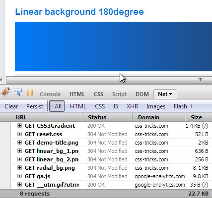
Firefox 3.5.8 did this (see screenshot), as well as Chrome 5- and Safari 5.0.1. See:
Safari 5.0.1 loading fallbacks improperly
The good news is this isn't really any issue anymore. The only offending browsers were Chrome and Safari and Chrome hasn't done it since 6 and Safari hasn't done it as of 5.1, going on three years ago.
Additional Resources
Snag a block of the CSS covering all prefixes/syntaxes from CSS3 Please!


