CSS-Tricks
CSS Gradients
Just as you can declare the background of an element to be a solid color in CSS, you can also declare that background to be a gradient. Using gradients declared in CSS, rather using an actual image file, is better for control and performance.
Gradients are typically one color that fades into another, but in CSS you can control every aspect of how that happens, from the direction to the colors (as many as you want) to where those color changes happen. Let's go through it all.
Gradients are background-image
While declaring the a solid color uses background-color property in CSS, gradients use background-image. This comes in useful in a few ways which we'll get into later. The shorthand background property will know what you mean if you declare one or the other.
.gradient {

  /* can be treated like a fallback */
  background-color: red;

  /* will be "on top", if browser supports it */
  background-image: linear-gradient(red, orange);

  /* these will reset other properties, like background-position, but it does know what you mean */
  background: red;
  background: linear-gradient(red, orange);

}
Linear Gradient
Perhaps the most common and useful type of gradient is the linear-gradient(). The gradients "axis" can go from left-to-right, top-to-bottom, or at any angle you chose.
Not declaring an angle will assume top-to-bottom:
.gradient {
  background-image:
    linear-gradient(
      red, #f06d06
    );
}
See the Pen BdhbD by Chris Coyier (@chriscoyier) on CodePen.
Those comma-separated colors can type of color you normally use: Hex, named colors, rgba, hsla, etc.
To make it left-to-right, you pass an additional parameter at the beginning of the linear-gradient() function starting with the word "to", indicating the direction, like "to right":
.gradient {
  background-image:
    linear-gradient(
      to right,
      red, #f06d06
    );
}
See the Pen zFoxn by Chris Coyier (@chriscoyier) on CodePen.
This "to" syntax works for corners as well. For instance if you wanted the axis of the gradient to start at the bottom left corner and go to the top right corner, you could say "to top right":
.gradient {
  background-image:
    linear-gradient(
      to top right,
      red, #f06d06
    );
}
See the Pen cruJe by Chris Coyier (@chriscoyier) on CodePen.
If that box was square, the angle of that gradient would have been 45°, but since it's not, it isn't. If you wanted to make sure it was 45°, you could declare that:
.gradient {
  background-image:
    linear-gradient(
      45deg,
      red, #f06d06
    );
}
You aren't limited to just two colors either. In fact you can have as many comma-separated colors as you want. Here's four:
.gradient {
  background-image:
    linear-gradient(
      to right,
      red,
      #f06d06,
      rgb(255, 255, 0),
      green
    );
}
See the Pen niIjA by Chris Coyier (@chriscoyier) on CodePen.
You can also declare where you want any particular color to "start". Those are called "color-stops". Say you wanted yellow to take up the majority of the space, but red only a little bit in the beginning, you could make the yellow color-stop pretty early:
.gradient {
  height: 100px;
  background-color: red;
  background-image:
    linear-gradient(
      to right,
      red,
      yellow 10%
    );
}
See the Pen xnqfj by Chris Coyier (@chriscoyier) on CodePen.
We tend to think of gradients as fading colors, but if you have two color stops that are the same, you can make a solid color instantly change to another solid color. This can be useful for declaring a full-height background that simulates columns.
.columns-bg {
  background-image:
    linear-gradient(
      to right,
      #fffdc2,
      #fffdc2 15%,
      #d7f0a2 15%,
      #d7f0a2 85%,
      #fffdc2 85%
    );
}
See the Pen csgoD by Chris Coyier (@chriscoyier) on CodePen.
Browser Support / Prefixes
So far we've only looked at the new syntax, but CSS gradients have been around for quite a while. Browser support is good. Where it gets tricky is syntax and prefixing. There are three different syntaxes that browsers have supported. This isn't what they are officially called, but you can think of it like:
- Old: original WebKit-only way, with stuff like from() and color-stop()
- Tweener: old angle system, e.g. "left"
- New: new angle system, e.g. "to right"
And then prefixing as well.
Let's try a chart:
| Chrome | 1-9: Old, prefixed 10-25: Tweener, prefixed 26: New, unprefixed |
|---|---|
| Safari | 3-: No support 4-5.0: Old, prefixed 5.1-6.0: Tweener, prefixed 6.1: New, unprefixed |
| Firefox | 3.5-: No support 3.6-15: Tweener, prefixed 16: New, unprefixed |
| Opera | 11.0-: No support 11.1-11.5: Tweener, prefixed, only linear 11.6-12: Tweener, prefixed, added radial 12.1: Tweener, unprefixed 15: New, unprefixed |
| IE | 8-: No support 9: filters only 10+: New, unprefixed (also supports Tweener w/ prefix) |
| Android | 2.0-: No support 2.1-3.0: Tweener, prefixed 4.0-4.3: New, prefixed 4.4+: New, unprefixed |
| iOS | 3-: No support 3.2-4.3: Tweener, prefixed 5.0-6.1: New, prefixed 7.0: New, unprefixed |
There is some overlap in there. For instance when a browser supports the New syntax they probably also support the older syntaxes as well, including the prefix. Best practice is: if it supports New, use New.
So if you wanted to absolute deepest possible browser support, a linear gradient might look like this:
.gradient {

  /* Fallback (could use .jpg/.png alternatively) */
  background-color: red;

  /* SVG fallback for IE 9 (could be data URI, or could use filter) */
  background-image: url(fallback-gradient.svg);

  /* Safari 4, Chrome 1-9, iOS 3.2-4.3, Android 2.1-3.0 */
  background-image:
    -webkit-gradient(linear, left top, right top, from(red), to(#f06d06));

  /* Safari 5.1, iOS 5.0-6.1, Chrome 10-25, Android 4.0-4.3 */
  background-image:
    -webkit-linear-gradient(left, red, #f06d06);

  /* Firefox 3.6 - 15 */
  background-image:
    -moz-linear-gradient(left, red, #f06d06);

  /* Opera 11.1 - 12 */
  background-image:
    -o-linear-gradient(left, red, #f06d06);

  /* Opera 15+, Chrome 25+, IE 10+, Firefox 16+, Safari 6.1+, iOS 7+, Android 4.4+ */
  background-image:
    linear-gradient(to right, red, #f06d06);

}
That's an awful lot of code there. Doing it by hand would be error-prone and a lot of work. Autoprefixer does a good job with it, allowing you to trim that amount of code back as you decide what browsers to support.
The Compass mixin can do SVG data URI's for IE 9 if that's important to you.
IE filters
Internet Explorer (IE) 6-9, while they don't support the CSS gradient syntax, do offer a programatic way to do background gradients
/* "Invalid", but works in 6-8 */
filter: progid:DXImageTransform.Microsoft.gradient(GradientType=0, startColorstr=#1471da, endColorstr=#1C85FB);

/* Valid, works in 8-9 */
-ms-filter: "progid:DXImageTransform.Microsoft.gradient (GradientType=0, startColorstr=#1471da, endColorstr=#1C85FB)";
There are some considerations here on deciding to use this or not:
filteris generally considered a bad practice for performance,background-imageoverrides filter, so if you need to use that for a fallback, filters are out. If a solid color is an acceptable fallback (background-color), filter is a possibility
Even though filters only work with hex values, you can still get alpha transparency by prefacing the hex value with the amount of transparency from 00 (0%) to FF (100%). Example:
rgba(92,47,90,1) == #FF5C2F5A
rgba(92,47,90,0) == #005C2F5A
Radial Gradients
Radial gradient differ from linear in that they start at a single point and emanate outwards. Gradients are often used to simulate a lighting, which as we know isn't always straight, so they can be useful to make a gradient seem even more natural.
The default is for the first color to start in the (center center) of the element and fade to the end color toward the edge of the element. The fade happens at an equal rate no matter which direction.
.gradient {
  background-image:
    radial-gradient(
      yellow,
      #f06d06
    );
}
See the Pen blcqw by Chris Coyier (@chriscoyier) on CodePen.
You can see how that gradient makes an elliptical shape, since the element is not a square. That is the default (ellipse, as the first parameter), but if we say we want a circle we can force it to be so:
.gradient {
  background-image:
    radial-gradient(
      circle,
      yellow,
      #f06d06
    );
}
Notice the gradient is circular, but only fades all the way to the ending color along the farthest edge. If we needed that circle to be entirely within the element, we could ensure that by specifying we want the fade to end by the "closest-side" as a space-separated value from the shape, like:
.gradient {
  background-image:
    radial-gradient(
      circle closest-side,
      yellow,
      #f06d06
    );
}
See the Pen EFyvp by Chris Coyier (@chriscoyier) on CodePen.
The possible values there are: closest-corner, closest-side, farthest-corner, farthest-side. You can think of it like: "I want this radial gradient to fade from the center point to the __________, and everywhere else fills in to accommodate that."
A radial gradient doesn't have to start at the default center either, you can specify a certain point by using "at ______" as part of the first parameter, like:
.gradient {
  background-image:
    radial-gradient(
      circle at top right,
      yellow,
      #f06d06
    );
}
I'll make it more obvious here by making the example a square and adjusting a color-stop:
See the Pen iuaDL by Chris Coyier (@chriscoyier) on CodePen.
Browser Support
It's largely the same as linear-gradient(), except a very old version of Opera, right when they started supporting gradients, only did linear and not radial.
But similar to linear, radial-gradient() has gone through some syntax changes. There is, again: "Old", "Tweener", and "New".
/* Example of Old */
background-image:
  -webkit-gradient(radial, center center, 0, center center, 141, from(black), to(white), color-stop(25%, blue), color-stop(40%, green), color-stop(60%, red), color-stop(80%, purple));

/* Example of Tweener */
background-image:
  -webkit-radial-gradient(45px 45px, farthest-corner, #F00 0%, #00F 100%) repeat scroll 0% 0% rgba(0, 0, 0, 0);

/* Example of New */
background-image:
  radial-gradient(circle farthest-side at right, #00F, #FFF);
The hallmarks being:
- Old: Prefixed with
-webkit-, stuff likefrom()andcolor-stop() - Tweener: First param was location of center. That will completely break now in browsers that support new syntax unprefixed, so make sure any tweener syntax is prefixed.
- New: Verbose first param, like "circle closest-corner at top right"
Again, I'd let Autoprefixer handle this. You write in the newest syntax, it does fallbacks. Radial gradients are more mind-bending than linear, so I'd recommend attempting to just get comfortable with the newest syntax and going with that (and if necessary, forget what you know about older syntaxes).
Repeating Gradients
With ever-so-slightly less browser support are repeating gradients. They come in both linear and radial varieties.
There is a trick, with non-repeating gradients, to create the gradient in such a way that if it was a little tiny rectangle, it would line up with other little tiny rectangle versions of itself to create a repeating pattern. So essentially create that gradient and set the background-size to make that little tiny rectangle. That made it easy to make stripes, which you could then rotate or whatever.
With repeating-linear-gradient(), you don't have to resort to that trickery. The size of the gradient is determined by the final color stop. If that's at 20px, the size of the gradient (which then repeats) is a 20px by 20px square.
.repeat {
  background-image:
    repeating-linear-gradient(
      45deg,
      yellow,
      yellow 10px,
      red 10px,
      red 20px /* determines size */
    );
}
See the Pen lAkyo by Chris Coyier (@chriscoyier) on CodePen.
Same with radial:
.repeat {
  background:
    repeating-radial-gradient(
      circle at 0 0,
      #eee,
      #ccc 50px
    );
}
See the Pen Repeating Gradients by Chris Coyier (@chriscoyier) on CodePen.
Improper Fallback Loading
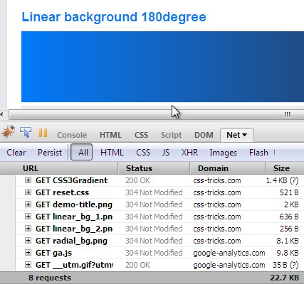
As we've covered, some really old browsers don't support any CSS gradient syntax at all. If you need a fallback that is still a gradient, an image (.jpg / .png) could do the trick. The scary part with that is that some slightly-less-old browsers, that were just starting to support CSS gradients, would load the fallback image. As in, make the HTTP request for the image even though it would render the CSS gradient.
Firefox 3.5.8 did this (see screenshot), as well as Chrome 5- and Safari 5.0.1. See:

The good news is this isn't really any issue anymore. The only offending browsers were Chrome and Safari and Chrome hasn't done it since 6 and Safari hasn't done it as of 5.1, going on three years ago.
Additional Resources
- Snag a block of the CSS covering all prefixes/syntaxes from CSS3 Please!
- Can I Use on gradients
- Mozilla docs for linear gradients, repeating liner gradient, radial gradient, and repeating linear gradient.
- Gradients Gallery (you can do some crazy patterns with gradients)
CSS Gradients is a post from CSS-Tricks
Keine Kommentare:
Kommentar veröffentlichen